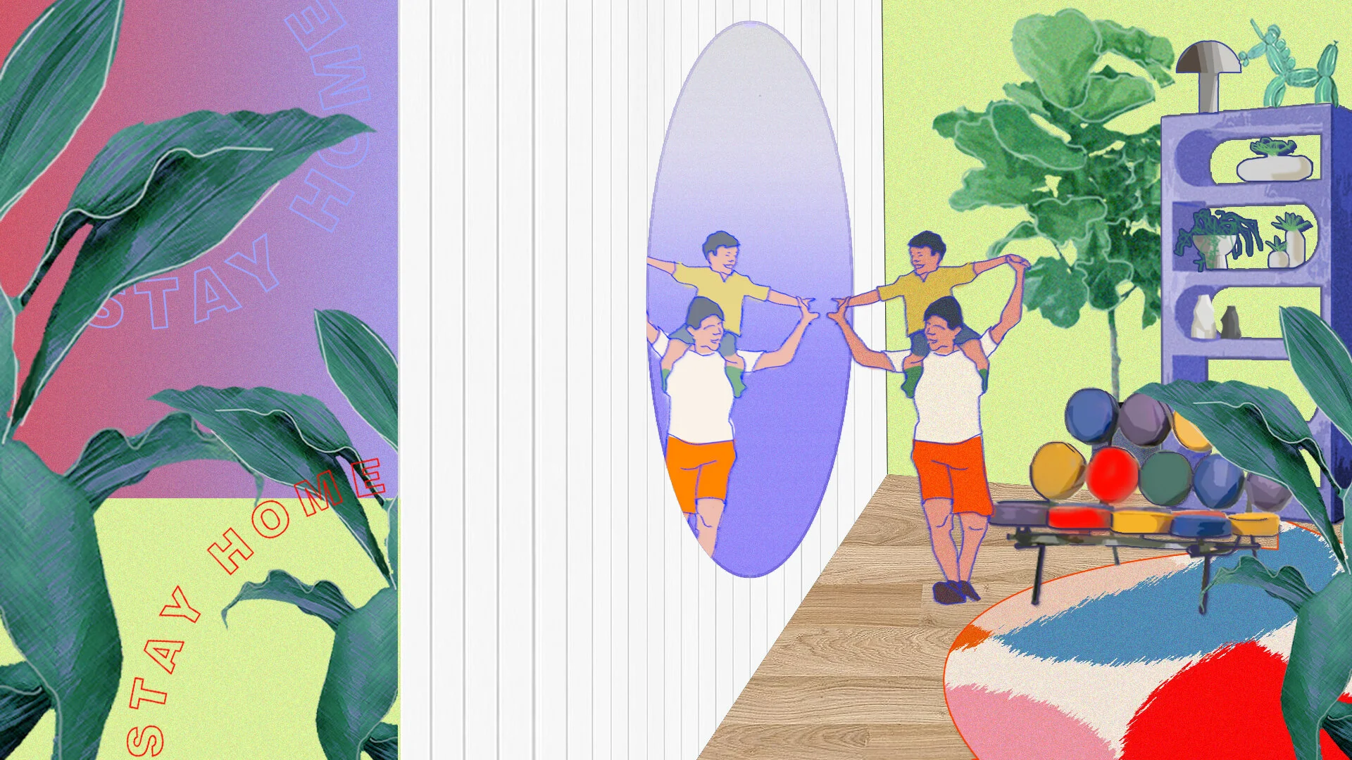
Hurray Illustrations: Andrea Vergara
As we talk about the Hurray Design themes more and more, we asked several designers (Interior Designers and Architects) who are also into doing Illustrations to take the challenge of interpreting our Hurray Design Themes. Choosing a theme that they are comfortable with and creating an illustration to show their design intent.
Today, we tap Andrea Vergaral, one of our very own Interior Designers at Hurray.
ANDREA VERGARA @dredreftw
Casual Eclectic family room
Tell us more about yourself?
Hi, I’m Andrea Vergara, an Interior Designer at Hurray Design. I love dogs.
What process and tools did you use for your illustration?
I played with Photoshop. It's a mosaic of material textures, image cutouts, playful text, I used a scene from a movie, I even used some of my own paintings I've made during the lock down.
Why did you choose these themes and areas?
It was more intuitive than anything. Eclectic and modern themes represent my appeal to color and form.
I have no particular reason for choosing the areas I did except for one illustration wherein I used a scene from one of my favorite movies, Parasite. I like the architecture of that house!
“Make the most out of that frame. Don’t add elements that won’t do service to your illustration. Everything should breathe life. ”
Modern Functional hall
Do you feel the output will work to convey the theme's design intent?
Yes. I added people and animals to add a sense of spirit in the scene. I wanted to be versatile in the subjects, so I included both kids and adults to convey that interior design is for all ages.
What's your advice for designers who want to try out illustrations for Schematic Design?
Trust your intuition! If you're not sold yet, revisit with fresh eyes. Polish and achieve that balance of art and design.
And what's your advice for Illustrators who want to do spaces and interiors?
Make the most out of that frame. Don't add elements that won't do service to your illustration. Everything should breathe life.
Bold Eclectic foyer
If you feel you have something to share and contribute, please do not hesitate to send us a message at beyond@hurraydesign.com. We would love to feature more!


