Hurray’s Review of Colors at the Milan Design Week 2024
An overview at this year’s Milan Design Week
When exploring interior design, Hurray Design's expertise and creative approach stand out. The Filipino multi-disciplinary interior design firm led by Principal Designer, IDr. Rossy Rojales. and Managing Director, Robert Rojales, are known for their ability to create functional and personalized spaces for their clients, with a special emphasis on color to enhance the overall design experience. The firm demonstrates its deep understanding of color theory and the application of modern design, focusing on how color can be used to evoke different emotions and create specific moods in a space.
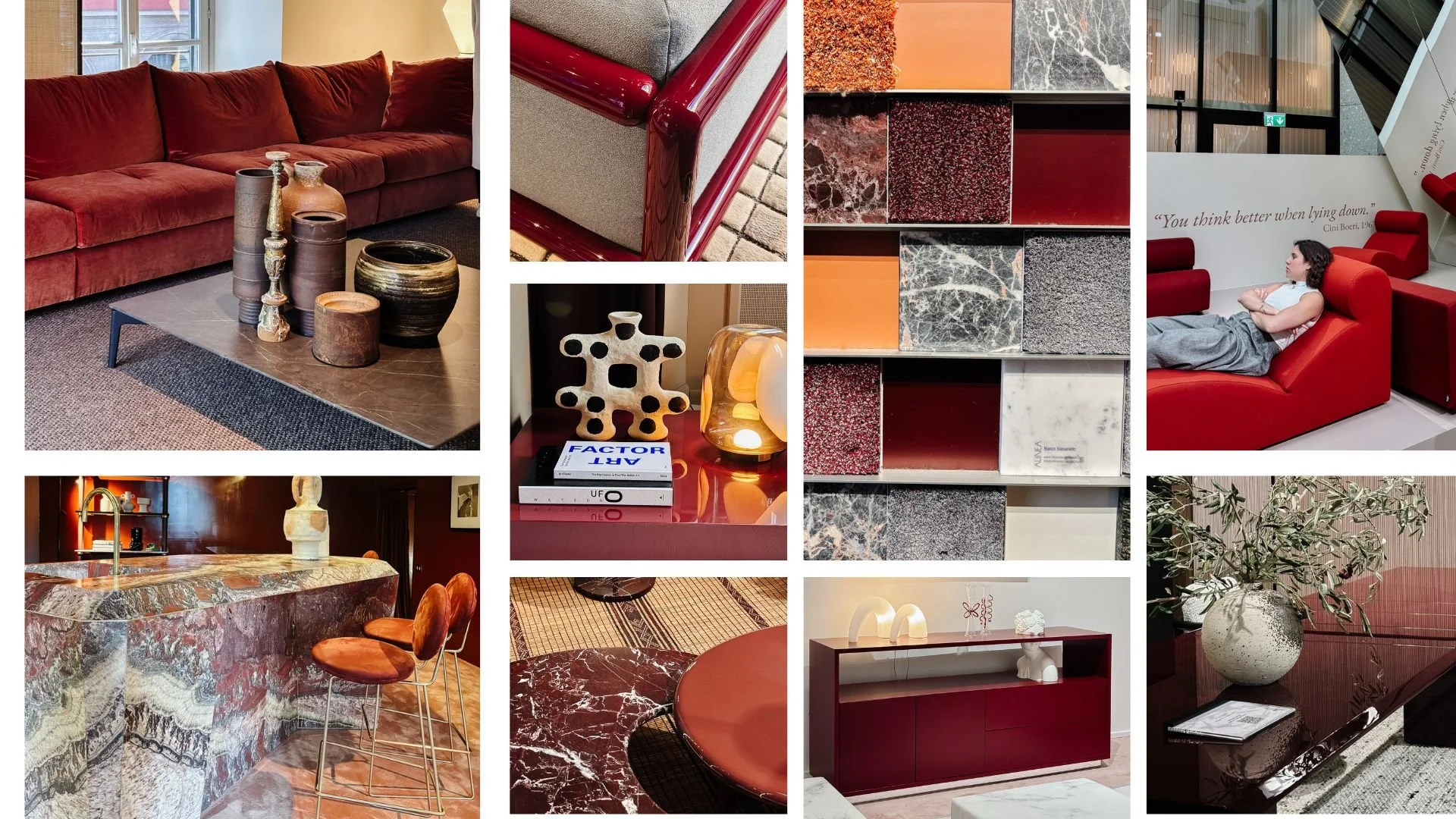
Bordeaux Furniture at MDV 2024
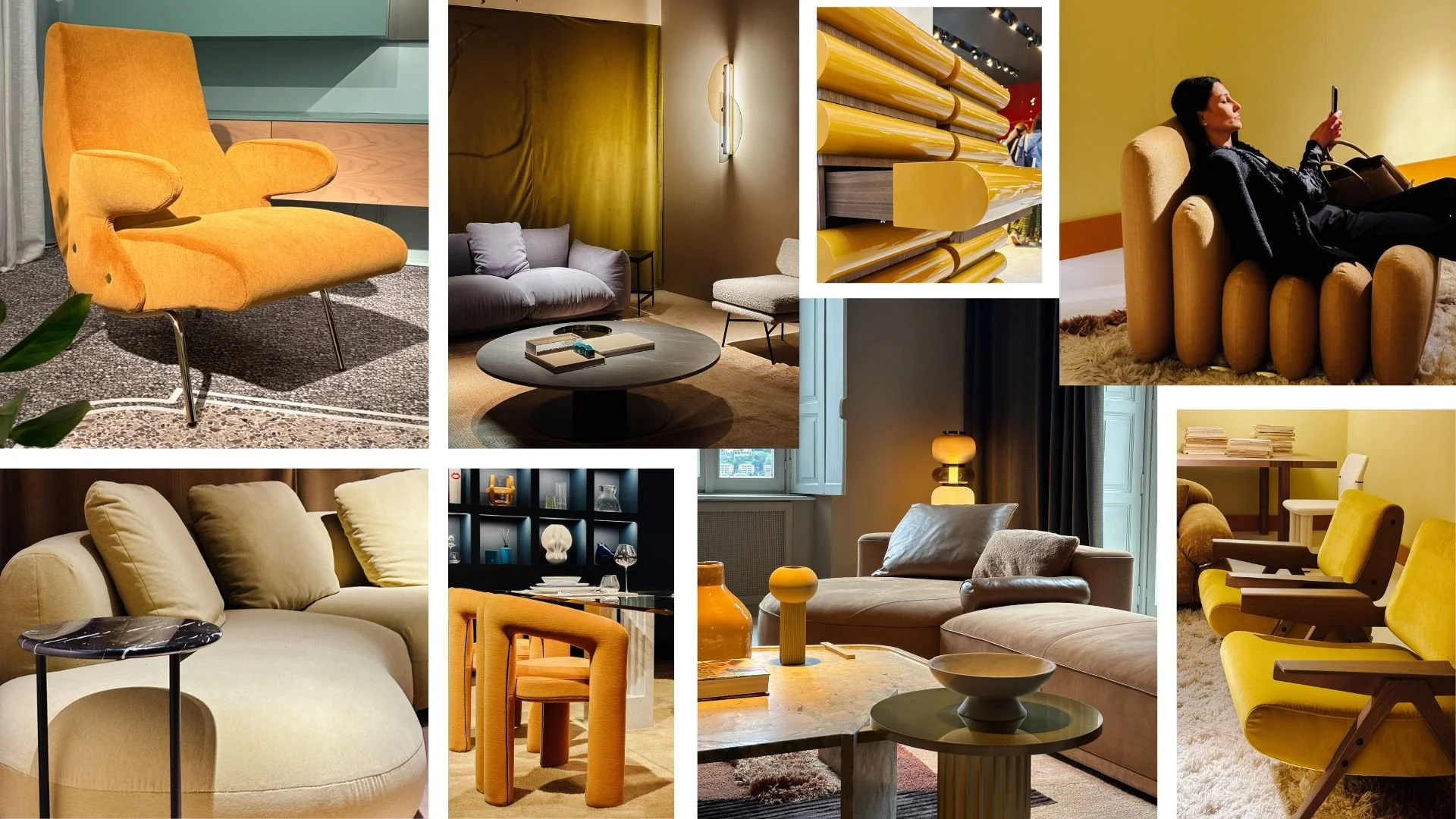
As one of the most prestigious and influential events in the world of design, this year’s Milan Design Week was no exception, with designers and brands showcasing their latest creations at the SuperSalone exhibition. IDr. Rossy of Hurray shared her insights on the current color trends and how they will influence interior design in the years to come. “The modern renaissance is back with captivating colors featuring Bordeaux, Cobalt, shades of green, and ochre. These colors exude a sense of maturity and timelessness, blending seamlessly into various interior styles,” IDr. Rossy continued.
A showcase of Green at the MDV 2024
While the pandemic has led to a prevalence of white and subtle ash tones, IDr. Rossy believes a resurgence of vibrant colors is expected in the coming years. Her review also highlighted the importance of color in interior design and its impact on mood and atmosphere. “Color evokes emotions based on our past experiences and memories. For example, green is often associated with nature and a feeling of calm and relaxation,” she explained. IDr. Rossy went on to discuss the timelessness of green and its versatility to integrate into any space. “Green in its various shades is a versatile and timeless color, providing a sense of comfort and connection to nature. It can be considered a neutral color that integrates well into any space,” she said.
We see Yellow at this year’s Milan Design Week
Finally, IDr. Rossy touched on the cultural influences on color choices and how designers can incorporate them into their designs. “Color preferences are shaped by cultural influences, such as the serene tones in Japanese design or the vibrant hues in Thai culture. In the Philippines, color choices reflect a diversity of cultural influences, ranging from neutral light colors to bold and expressive hues,” she noted.
Hurray’s mission is to celebrate Filipino design on a global scale. This challenge aims to find what is most personal to people and incorporate that into their design work. By highlighting the diverse cultural influences and unique color preferences in the Philippines, Hurray can create spaces that resonate deeply with their audience. This review of color trends at Milan Design Week hopes to provide valuable insights that can be applied to projects focused on celebrating Filipino identity and aesthetics.
This is part 1 of our 2-part series on this year’s Milan Design Week. We can’t wait to share our next blog soon at Beyond Ordinary!


