Part 2: A First Look at the Luxury Living in the Skies
By Andrea Cortina-Portugal
From renderings to reality, we’re taking a look at the completed Luxury Living in the Skies and see what the clients have to say about the space they now call home and the team that made the magic happen.
PHOTO COVER Luxury Living in the Skies
“We were all shocked with excitement and happiness,” exclaims the lady of the house, describing their initial reactions upon walking into the finished space. “The sketch of the designs they presented (to) us are exactly what happened in the actual unit.”
Having set their minds on a Practical Luxury theme that hinged on Italian design sensibilities, Team Hurray and the clients, a couple and their two daughters, worked in collaborative effort to bring their vision to life.
PHOTO 2 OF 12 The dining area is made grand with its hand-blown glass chandelier by Czech brand, Preciosa, and Italian custom table and chairs from FM Arch
Overall, the home is a study in balance. Rich textures anchor themselves nicely on a neutral color palette, fine ornate details and modern geometric forms liven up each room in equal measure, and luxury meets practicality to create a home that is as cozy and inviting as it is awe-inspiring.
“The most exciting process for us is when we’d meet with Hurray to brainstorm some ideas to create the designs we really wanted,” shares the lady of the house. “When they finished the entire unit, we knew that it was very important that we picked Hurray as our designer because every corner of the unit is something we are still mesmerized (by) and everyday we are in shock that this is what our home looks like.”
The common areas and each individual room were thoughtfully designed to have their own distinct character without veering away from the overall theme of the home.
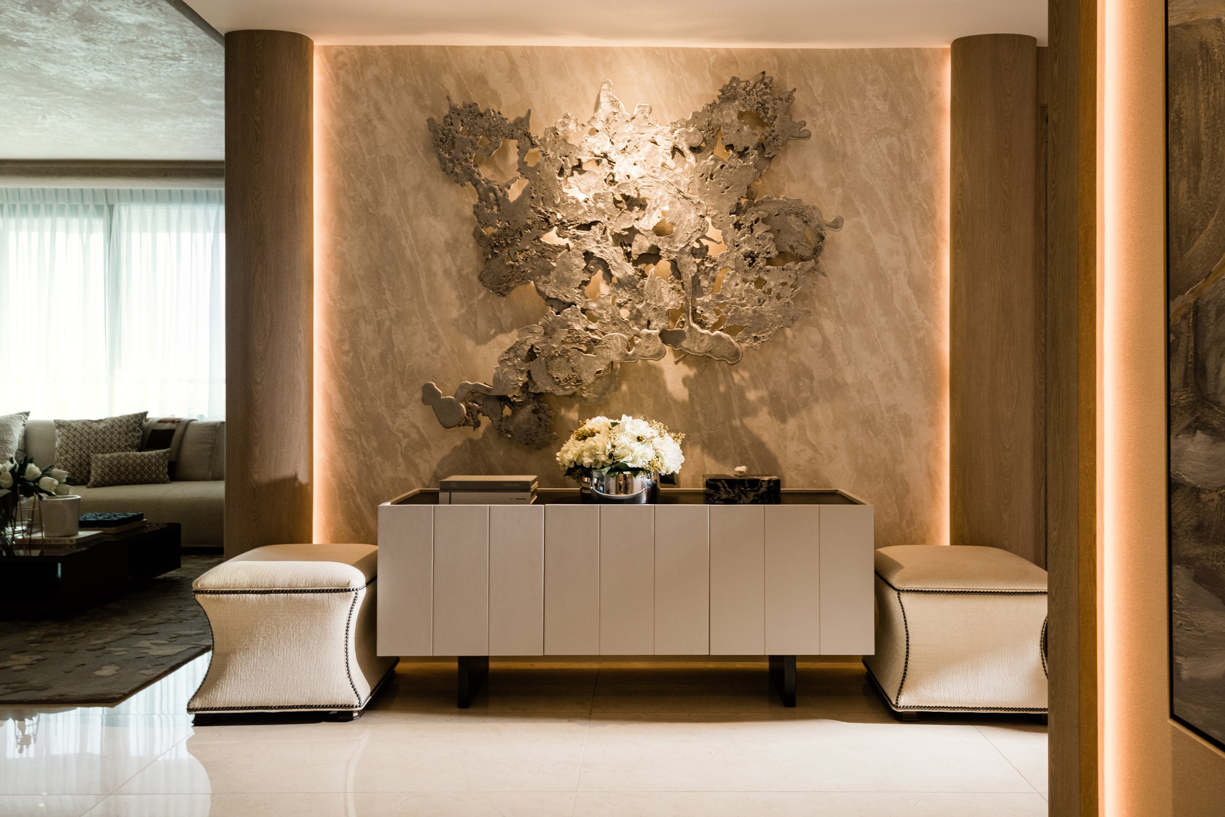
PHOTO 3 OF 12 The pictured foyer features a custom art piece from Jinggoy Buensuceso
In the foyer, two Corbin ottomans from Ethan Allen flank either side of a modern sideboard, subtly underscoring a piece by Jinggoy Buensuceso.
PHOTO 4 OF 12 Quality craftsmanship. Pictured is the home’s powder room with its wall and sink cladding of natural stone finishes
Facing the foyer is the powder room where gold finishes, marble stone, and metallic wall covering all come together to create a “moment” within a largely neutral home.
PHOTO 5 OF 12 The completed living and dining areas. Also pictured is the hand-painted ceiling by artist Alfred Galvez of Mikra Faux and a custom rug from Studio Pino
The living, dining, and kitchen areas share an open layout creating a space akin to a great room, with the flair of a hotel lobby and the sweeping views of a penthouse. Furniture pieces with modern silhouettes and muted fabric finishes are an ode to the quiet elegance that is characteristic of the entire home. A custom rug by Studio Soliven encompasses both the living and dining areas, highlighting the expansive floor area and playing up on scale.
PHOTO 6 OF 12 Kitchen with pieces from Siematic, Subzero, and SMEG
Across the room, the open kitchen features the prominent use of marble on the countertops, waterfall island, and backsplash. Barstools with arched backs complement the marble’s undulating veins, both adding drama to an otherwise simple, clean space.
PHOTO 7 OF 12 Details in the design. Pictured above is the entertainment room’s mini bar suitable for the family’s movie-watching
A combination of angled lines on modern wall cladding and rugged strokes on natural stone surfaces lend a sense of constant movement in the entertainment or family room, setting the tone for a space that is both flexible and fun—complete with a roomy LaZboy lounge sofa. “It seems that every room makes us feel we are transported to a different location every time we enter one,” shares the client.
PHOTO 8 OF 12 Metallic chrome accents in the Master Bedroom. Also pictured are the custom headboard and Ethan Allen bed.
Each of the bedrooms pay homage to the personalities of its inhabitants. Sophisticated and warm, the master bedroom features predominantly soft finishes, with metal accents thoughtfully positioned across the space, subtly adding shine and depth. A plush headboard set against an accent wall of beaded wallpaper, chrome metal trim and leather padded panels draws the eye upward, giving the room a light and airy feeling in spite of the relatively large proportions of its furnishings.
PHOTO 9 OF 12 Second bedroom
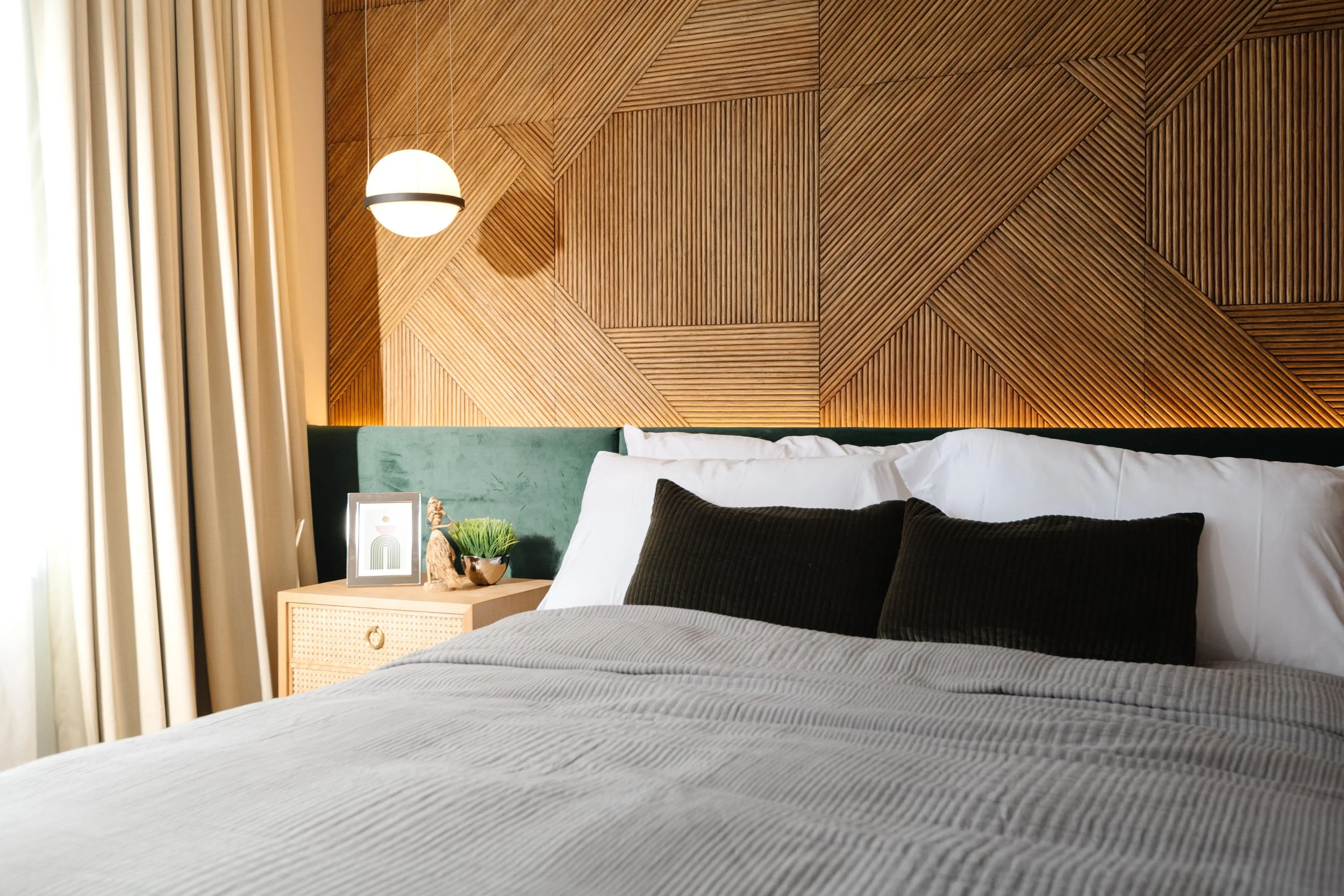
If there is one room that slightly veers away from the neutral palette of the home, it’s the second bedroom. Deep green tones and walnut floors give the room an earthy laid-back vibe, reminiscent of boutique hotel rooms typically found by the beach. Light wood finishes, sandy-hued drapery, and cool gray accents make up the perfect mix for the client’s desired boho-inspired style. Pointing to the geometric wood cladding above the headboard as her daughter’s favorite element in her room, the lady of the house goes on to say, “She always wanted a room that relaxes her after school, so this is a perfect sanctuary space for her.” The second bedroom’s T&B also picks up on the earthy vibe with deep green vertically stacked subway tiles and gold fixtures accentuating the shower area.
PHOTO 10 OF 12 The home’s third bedroom
In contrast to her sister, the couple’s other daughter took inspiration from Kelly Wearstler’s design philosophy, having a multi-layered space with organic forms and the intuitive juxtaposition of contemporary and vintage pieces in mind when envisioning her room. The use of a bold wallpaper pattern accentuates the hefty cylindrical column in one corner of the room, transforming it from eyesore to conversation starter, much like the classic Arne Jacobsen drop chair by it.
PHOTO 11 OF 12 Arched shelf with the bold wallpaper pattern
The same patterned wallpaper is used across the room to highlight an arched niche bookcase. The third bedroom’s T&B also features gold fixtures, this time set against gray-veined marble on the walls and floor.
PHOTO 12 OF 12 Third bedroom’s en suite bathroom
On what they love most about their home, the couple shares, “We simply love the design of everything all together. Hurray did a good job of matching all the pieces together that it turned out more perfect than we expected.” To that end, Team Hurray is happy to have achieved our goal of creating spaces that celebrate our clients.
To read about how this project came together, click here.
If you like this project and want to see more of our designs, visit our Works today. And don’t forget to check out our other articles at Beyond Ordinary!


